Interactive Agriculture Data Visualization
Overview
The goal of this project is to visualize an agricultural dataset Climate Change Impact on Agriculture. This dataset contains agricultural and location data from 1990 to 2024. I used two ways to present the data: globe and scatter plot.
The dataset was modified to have a key city with each distinct country-region pair that are known for their agriculture within the region. The cities were determined by ChatGPT, and then the Latitude and Longitude were found based on the cities.
A more detailed documentation can be found here.
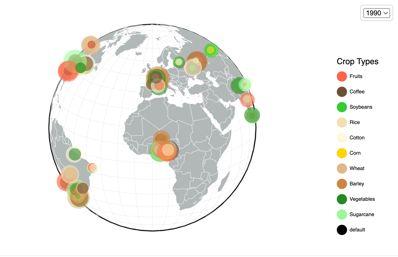
The Globe
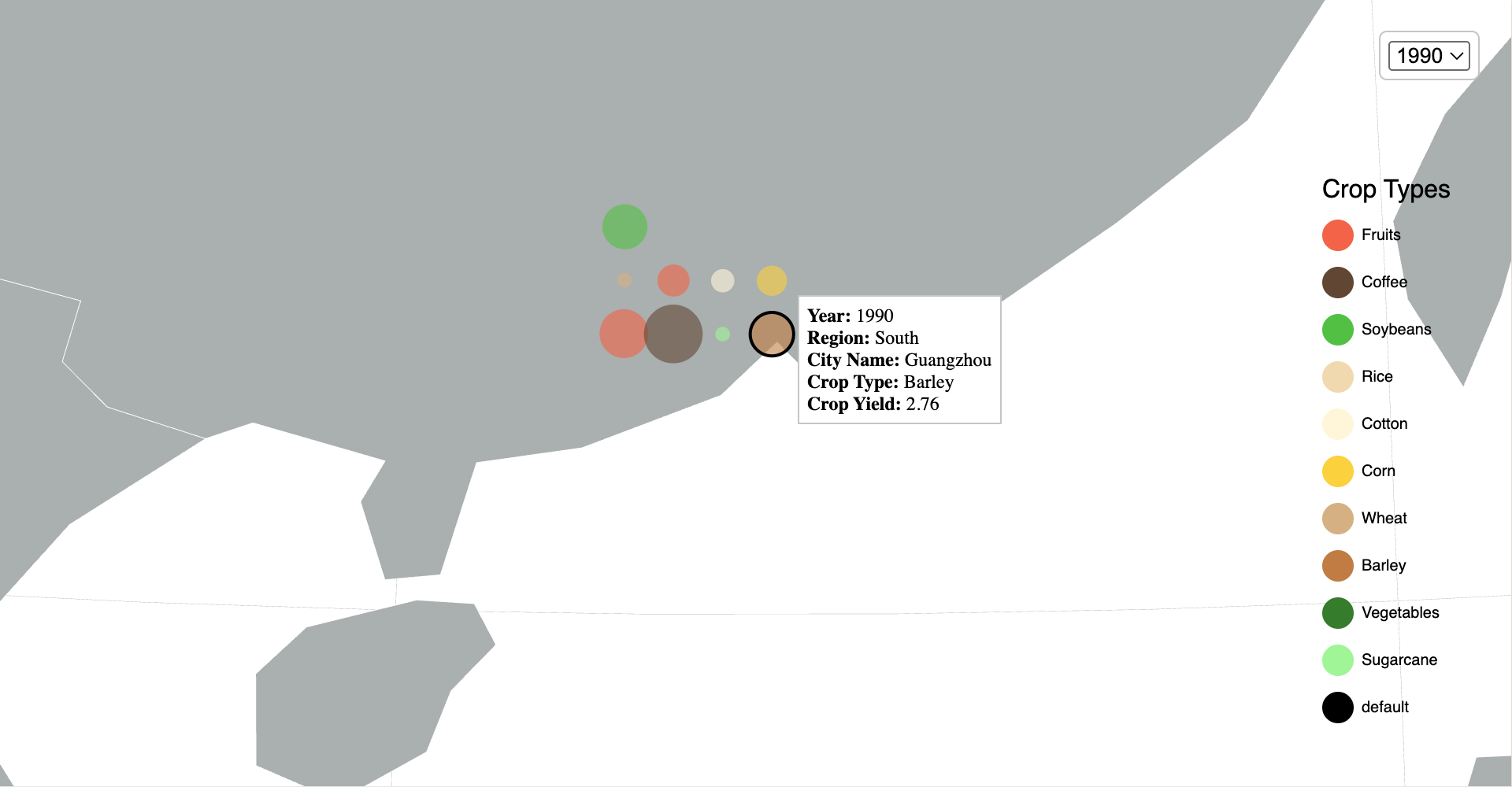
The globe shows crop yields (dot size) and crop type (color) by region over time, allowing users to compare productivity of different types of crop across different areas within the same year.
Users can interact with the globe by spinning and zooming in on specific regions to see detailed information about crop yields and location.
Users can also click on a certain crop type from the side bar, color-legend will show only the selected crop type; click again will dis-select and show all crop type.
Key Features
- Feature 1: Spin and zoom
- Feature 2: Select data by year
- Feature 3: Select data by crop type
- Feature 4: More information in tooltips when mouse hovers over.
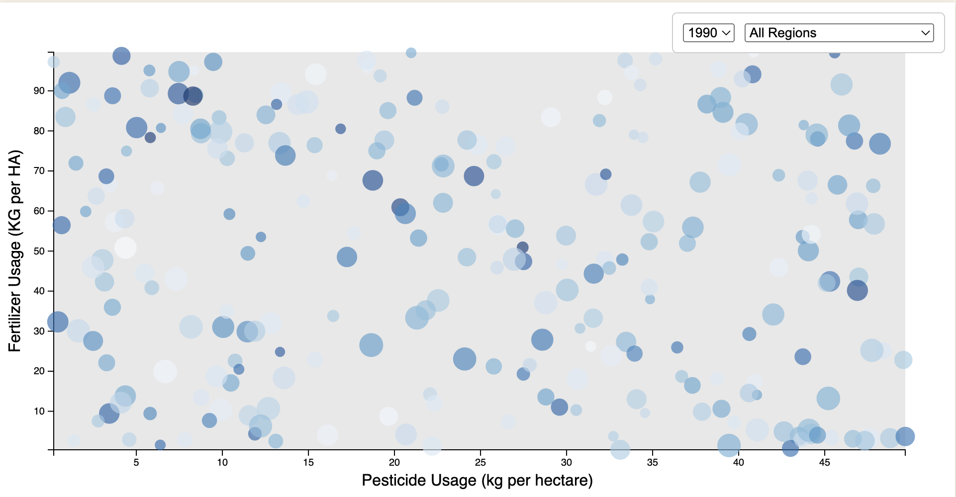
The Scatter Plot
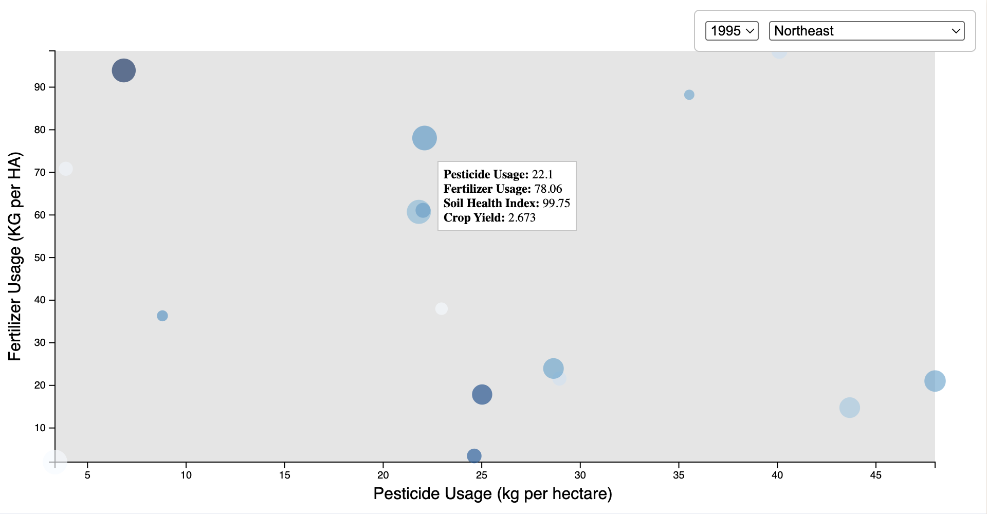
The scatter plot shows Pesticide Usage (kg per hectare) by Fertilizer Usage (KG per HA) with crop yields and health index, giving users a quick and intuitive overview of how the crop yields and health index might be effected by pesticide and fertilizer.
In the graph, x is the Pesticide Usage (kg per hectare) and y is the Fertilizer Usage (KG per HA); The sizes of the circles are the crop yield; The color of the circles is the the soil health index, deeper the color, healthier the soil. The dropdown is for year and region selection.
Key Features
- Feature 1: Quick and intuitive data viewing
- Feature 2: Select data by year
- Feature 3: Select data by Region
- Feature 4: Using color as an addition way to present data